Rooms by Criterion · No. 2
Color With Gravity
The Whole-Home Color Palette: How to Choose Paint, Textiles, Art, and Finishes That Work Together
A 72-page field guide for making a home feel connected from room to room—without painting everything the same neutral or copying a preset palette.
One-time purchase · immediate private library access · secure PDF downloads
See inside the book ↓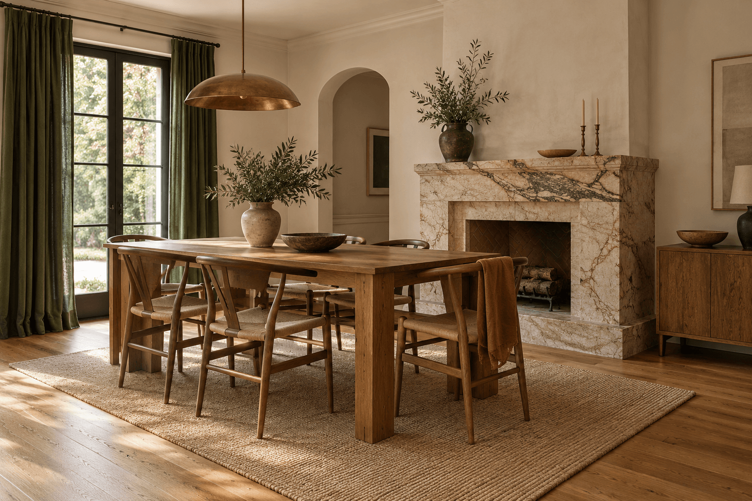
Selected pages · Founding edition
See color become a working system.
Seventy-two pages move from fixed finishes and lived light to thresholds, material translation, six atmosphere systems, and a final whole-home plan. These are real pages from the finished edition.
- 72
- pages
- 08
- room studies
- 10
- diagrams
- 10
- worksheets
The proposition
A color book about relationships, not recipes.
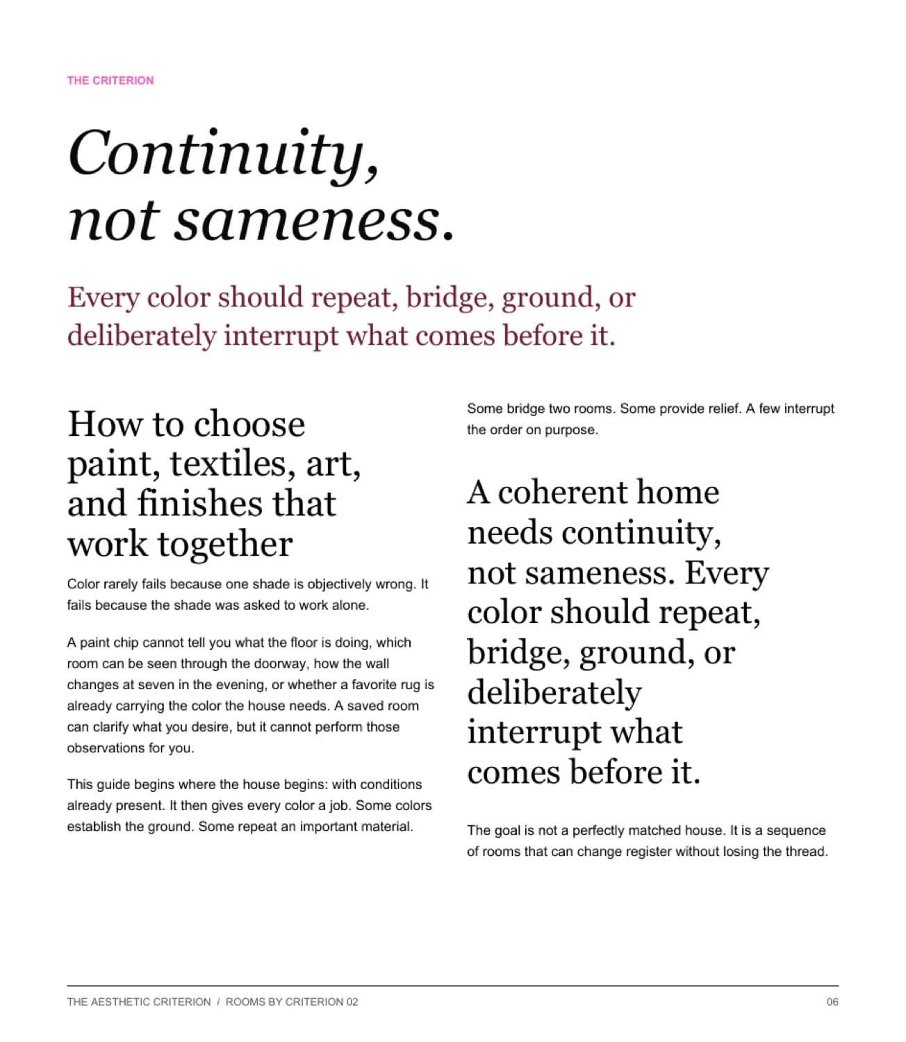
The edition opens with a whole-home sequence, then states the criterion that holds every later decision together.
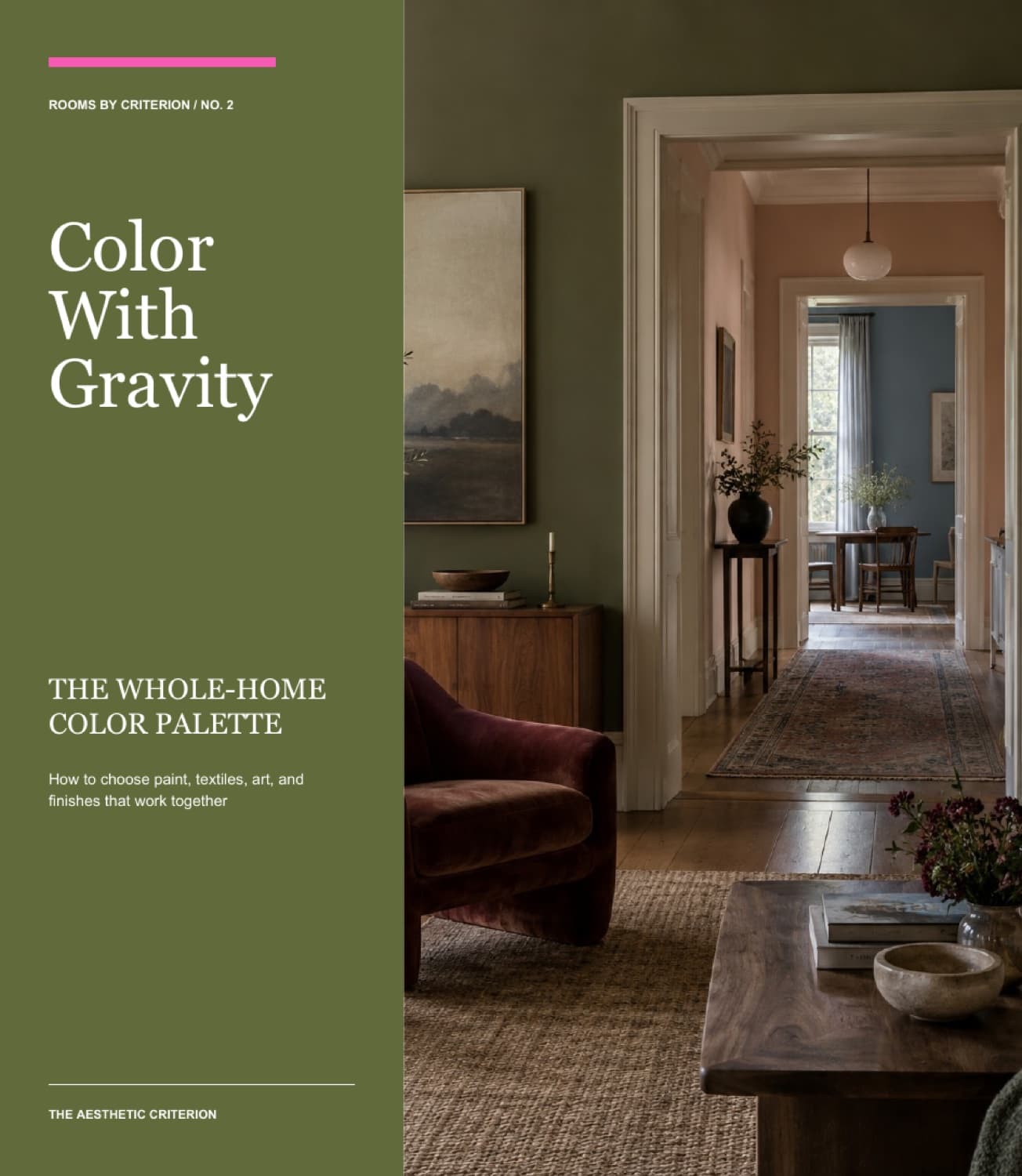
Look, then read
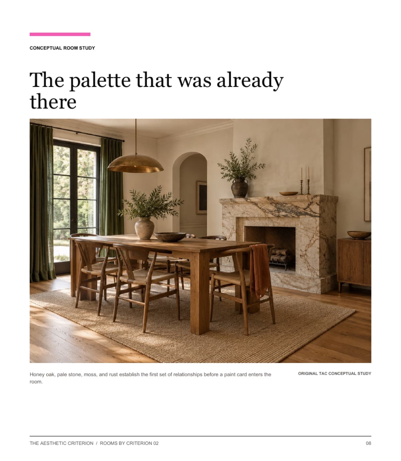
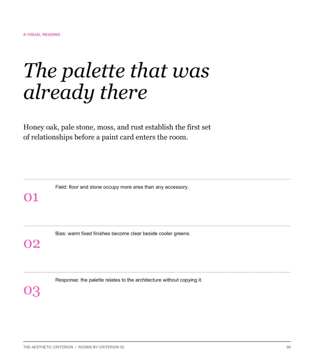
Room studies train the eye before offering a rule.
The reader first sees the relationship, then gets a concise visual reading of field, bias, and response.
Lived conditions
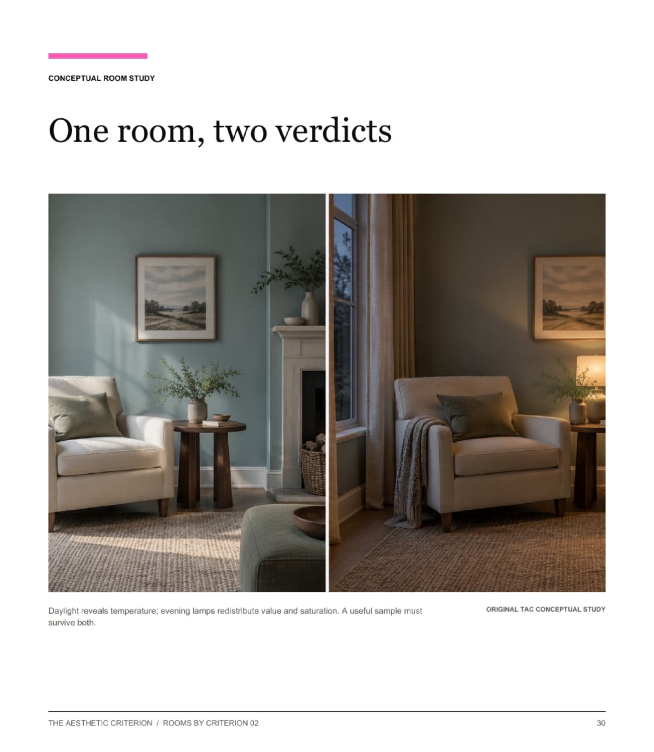
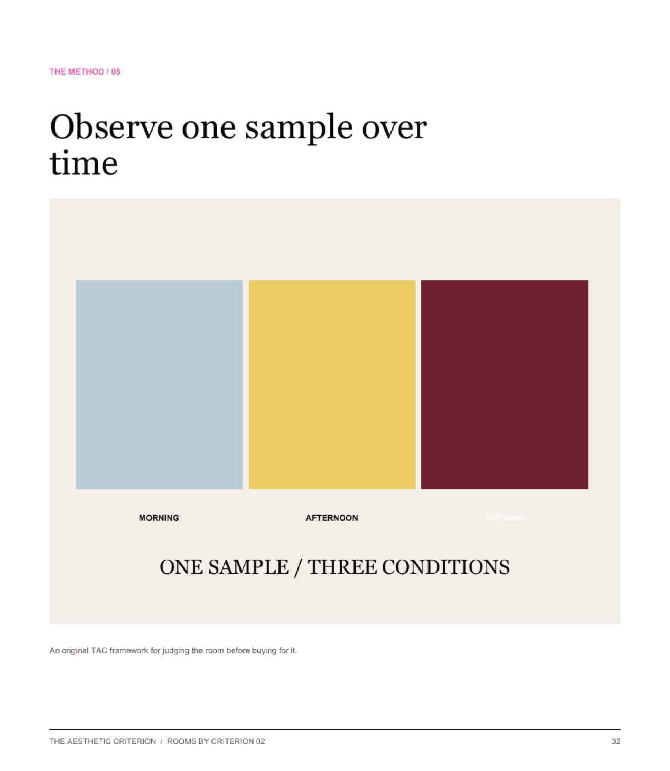
Light is treated as part of the specification.
A day-to-night study becomes a method for testing one large sample under the conditions of real life.
Method into plan
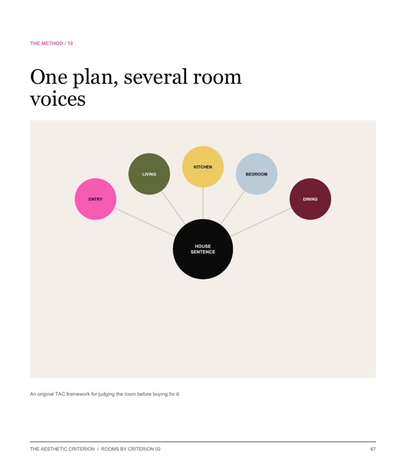
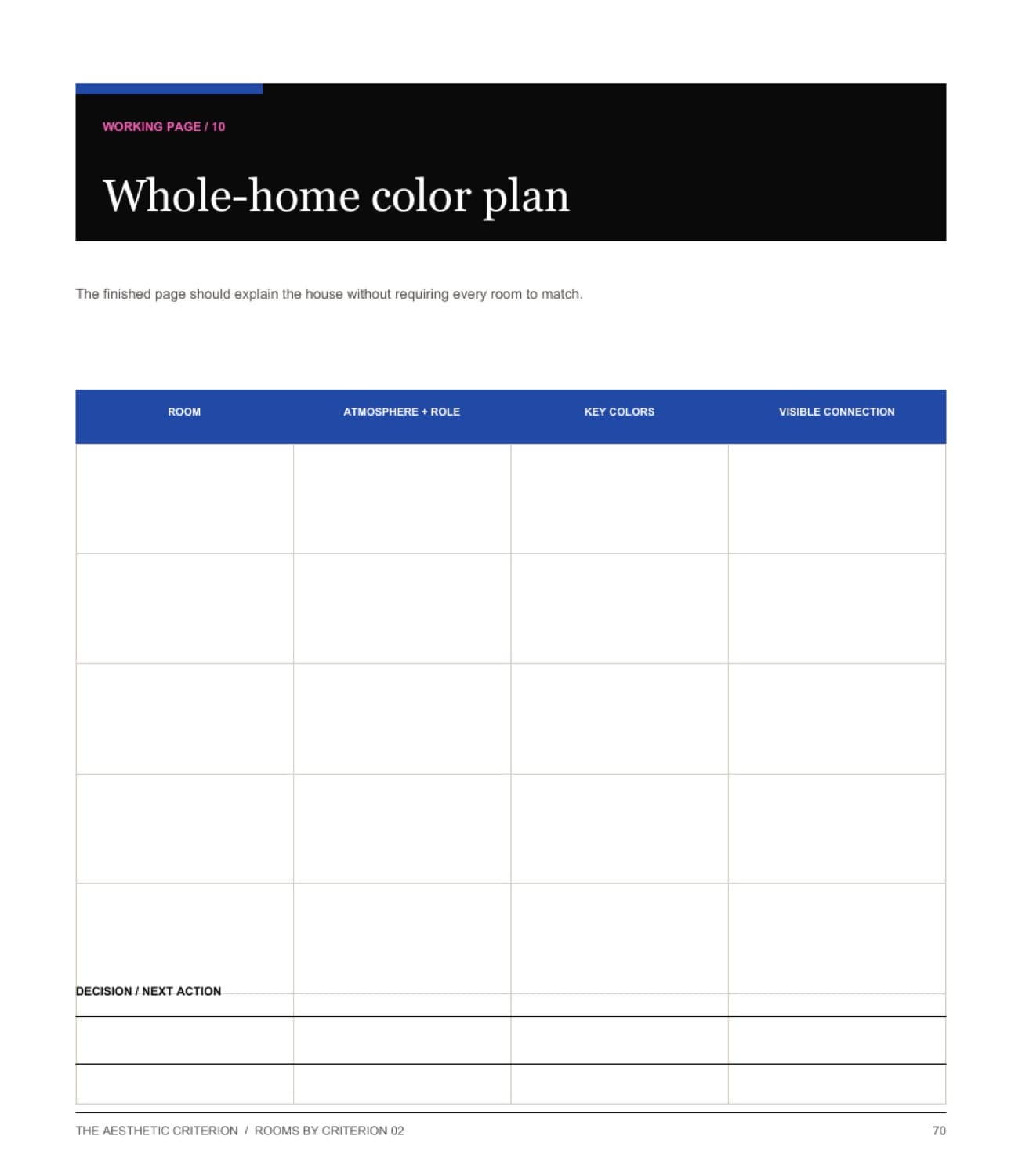
Ten working pages turn seeing into decisions.
The final chapters narrow choices, specify surfaces, and consolidate every room into one legible whole-home plan.
The complete founding edition includes the 72-page illustrated design book, ten integrated working pages, and a private web reading edition.
Buy the editionThe criterion
Continuity, not sameness.
A coherent home needs continuity, not sameness. Every color should repeat, bridge, ground, or deliberately interrupt what comes before it.
Two studies from the method
Light · thresholds · atmosphere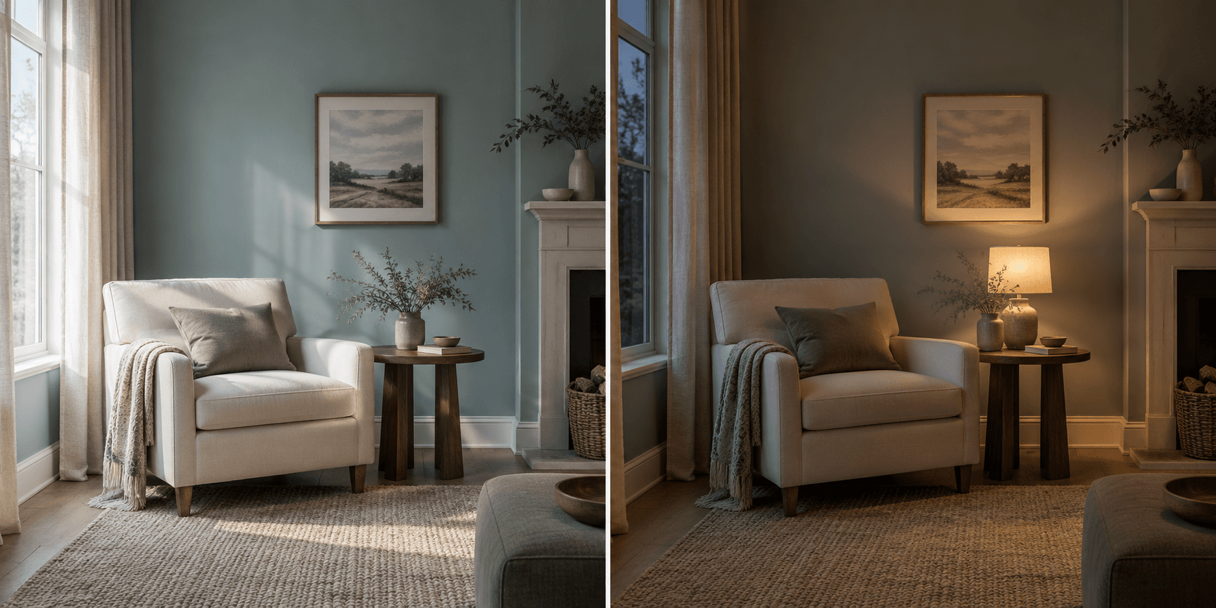
Inside the guide
Ten color decisions, in order- 01
Read the colors already present
Begin with fixed finishes, committed objects, and the fields that already have authority.
- 02
Name the atmosphere before the hue
Turn a vague mood into value, temperature, contrast, material, and distribution.
- 03
See color relationally
Compare value, saturation, and temperature beside the surfaces that will remain.
- 04
Build a five-role palette
Assign ground, structure, bridge, relief, and interruption instead of collecting favorites.
- 05
Let light change the verdict
Test large samples through the day and under the lamps actually used at night.
- 06
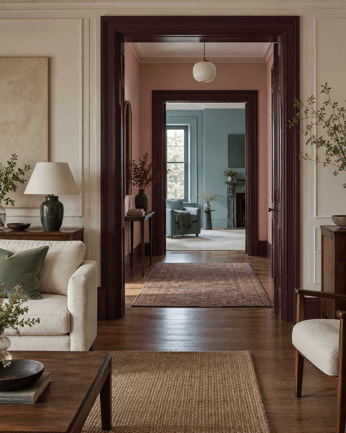
Carry color between rooms
Use repetition, bridges, structural darks, and deliberate breaks across thresholds.
- 07
Treat paint as one surface
Translate color through fiber, wood, stone, metal, art, pattern, and sheen.
- 08
Use six atmosphere systems
Adapt expressive, cool, graphic, warm, classic, or pale systems without copying a style kit.
- 09
Test, specify, and buy
Narrow candidates, record observations, specify surfaces, and buy only when a named gap remains.
- 10
Complete the whole-home plan
Give every room its own voice while preserving the thread across the house.
Not another preset palette
Leave with a whole-home color plan.
The guide begins with the floors, counters, cabinetry, art, textiles, and light already present. Paint and purchases come only after those relationships are understood.
- Fixed-finish inventory
- Atmosphere sentence builder
- Color relationship test
- Five-role palette builder
- Sample observation log
- Room-to-room sightline map
- Material and finish translator
- Atmosphere translation worksheet
- Final sample decision record
- Whole-home color plan
The complete edition
Three ways to use itIllustrated design-book pages
The full ten-chapter argument, 8 conceptual room studies, 10 original diagrams, practical examples, and source notes.
Integrated working pages
Printable tools taught inside the book, so each observation method leads directly to a decision in the reader’s own rooms.
Web reading edition
A responsive edition with chapter navigation and diagrams, held in the buyer’s TAC Library alongside the downloadable files.
A sample from the method
Read the colors your home has already chosen.
Before choosing a wall color, photograph the surfaces that would remain if the room were emptied: flooring, stone, tile, cabinetry, built-ins, brick, metal, window frames, and the light itself. Together they form the first palette.
A paint chip cannot tell you what the floor is doing, which room can be seen through the doorway, or how the wall changes at seven in the evening.
Begin before buying samples
- Name the largest fixed color field in every room.
- Photograph each important doorway and the rooms visible through it.
- Write the time of day when every room is actually used.
Five blue accessories may occupy less visual area than one wood floor. Read the room by field size and visual weight, then decide which color should ground, structure, bridge, relieve, or deliberately interrupt it.
Rooms by Criterion · Founding edition
Keep the complete method close.
Purchase once and the full reading edition joins your private TAC Library, with the illustrated book and working sheets ready to download.
Buy for $29